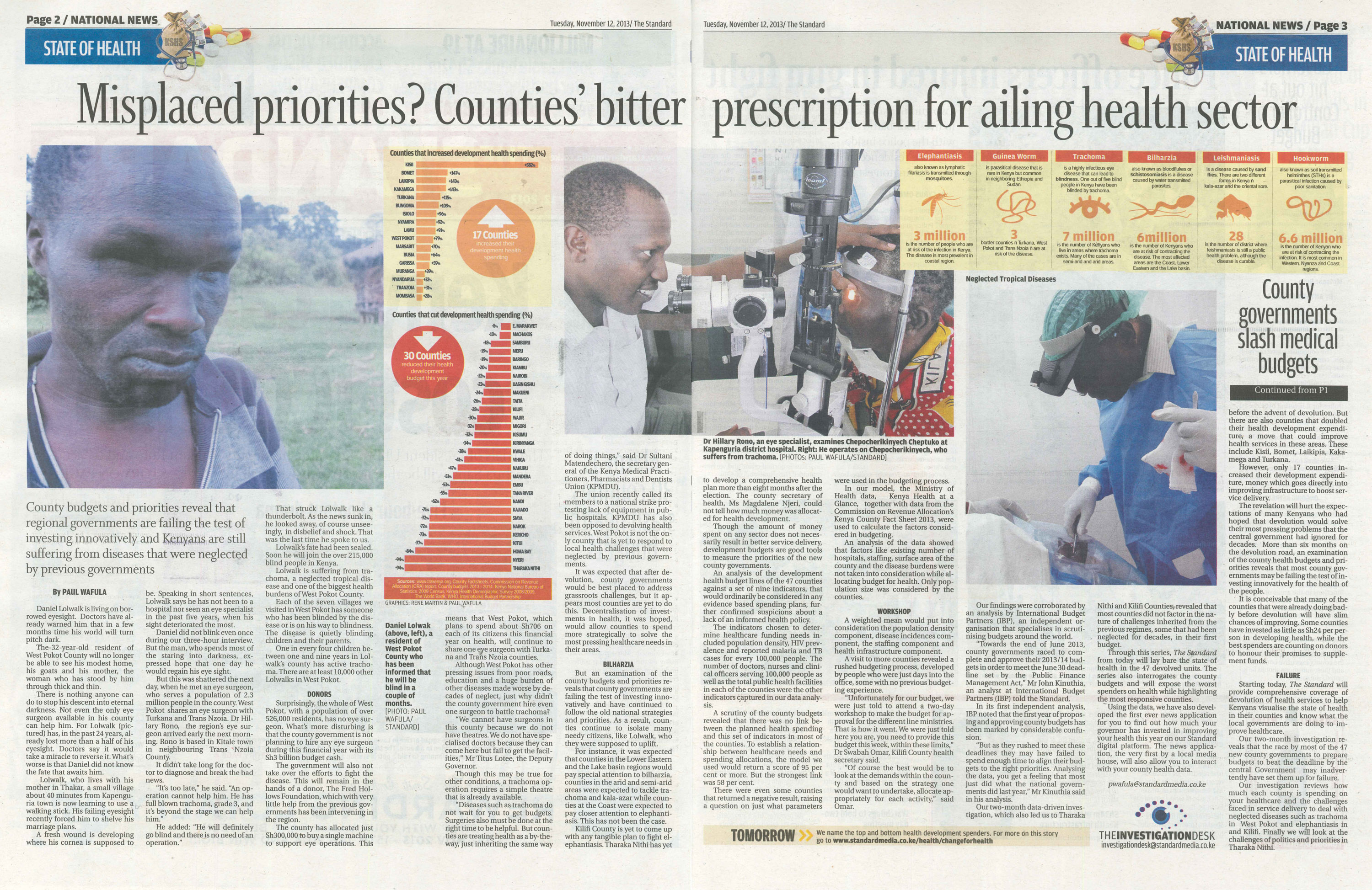
Category Archives: Data Journalism

Permalink to single post

Data Journalism Workshop, May 26 – 30

Objectives: By the end of workshop participants should be able to:

  1. Appreciate data journalism
  2. Mine, scrape and analyze data on health
  3. Use simple tools to visualize data
  4. Write a data driven story proposal
  5. Package data into simple, compelling and accessible stories.


Day One:                 Monday 26

08:30 – 09:30            Introduction/Expectations/Survey – Dorothy/Lydia

09:30 – 11:00            Journalism in the age of data – Dorothy

11:00 – 11:30           Tea break

11:30 – 01:00            Finding stories in data – Eva

01:00 02:00           Lunch

02:00 – 03:30            Interviewing your data – Dorothy

03:30 – 03:45           Tea break

03:45 – 05:15            Multimedia storytelling – Dol


Day Two                    Tuesday 27

09:00 – 10:00            Finding data for stories – Eva

10:00 – 11:30            Finding data on the web – Eva

11:30 – 12:00           Tea break

12:00 – 01:00            Cleaning your data – Aggrey

01:30 – 02:30           Lunch

02:00 – 04:00            Converting data into friendly formats – Eva/ Agnes

04:00 – 04:15           Tea break

04:15 – 05:15            Introduction to the Data Dredger – Dorothy


Day Three                 Wednesday 28

09:00 – 10:30            Math and statistics for journalists  – Dorothy

10:30 – 10:45           Tea break

10:45 – 12:15            Finding interrelationships in data – Dorothy /Aggrey

12:15 – 01:15            How data informs my storytelling – Paul Wafula, The Standard

01:15 – 02:15           Lunch

02:15 – 03:45            Creating compelling visuals – Agnes

03:45 – 04:00           Tea break

04:00 – 05:30            Data visualization for journalism – Agnes

(Visualisation assignment)


Day Four:                 Thursday 29

09:00 – 10:00            Review assignment – Agnes/Eva

10:00 – 11:30            Creating maps with maps engine – Eva

11:30 12:00           Tea break

12: 00 – 01:30           Long–form, multimedia storytelling (part one) – Dorothy /Eva

(Exercise& discussion)

01:30 – 02:30           Lunch

02:30 – 04:00            Interpreting quantitative research results:  distinguishing good

research from bad –Suleiman Asman, Innovation for Poverty Actions


04:00 – 04:15           Tea break

04:15 – 05:00            Long–form, multimedia storytelling (part two) – Eva/ Dorothy


Day Five:                  Friday 30

09:00 – 10:30            Recap – All trainers

10:30 – 11:00           Tea break

11:00 – 01:30            Story Mapping – All trainers

01:30 – 02:30           Lunch

02:30 – 05:00            Data Expedition – Eva/Dorothy/Agnes

05:00 – 5:15              Evaluation


Permalink to single post

Data cleaning Guide for Journalists

DATA CLEANING
Data journalism workshops can make the data journalism process seem much faster and more straight-forward than it really is. In reality, most data doesn’t arrive organized and error-free. Most data is messy. Before beginning any kind of analysis, the data needs to be cleaned. Data cleaning is a process data journalists use to detect, correct or delete inaccurate, incomplete, or erroneous data with an aim of improving data quality. Examples of errors commonly found in data are:
1. Wrong date formats or incorrect dates like 30th February, 2013.
2. Unknown characters.
3. Missing data.
4. Spaces before and after values.
5. Data that is beyond rage for example, age of a human being recorded as 879 years.
6. Inconsistency.
7. Other errors.
Data cleaning is also known as:
1. Error Checking
2. Error Detection
3. Data Validation
4. Data Cleansing
5. Data Scrubbing
6. Error Correction

The process of data cleaning may include:
1. Format checks
2. Completeness checks
3. Reasonableness checks.
4. Limit checks
5. Review of the data to identify outliers
6. Assessment of data by subject area experts (e.g. Doctors assessing Kenya Health at a Glance data)
These processes usually result in flagging, documenting and subsequent checking and correcting of suspect records. In advanced data management, validation checks may also involve checking for compliance against applicable standards, rules, and conventions.
The general framework for data cleaning is:
1. Define and determine error types.
2. Search and identify error instances.
3. Correct the errors.
4. Document error instances and error types.
5. Modify data entry procedures (or regular expressions in during data scrapping) to reduce future errors.
Data journalists often use these tools for data cleaning:
1. Open Refine.
2. Excel.
Advanced data cleaning may be done in SQL, STATA, SAS and other Statistical applications to detect errors. If errors are well documented and analyzed, it can help data journalists and program managers to prevent more errors from happening.

HOW TO USE OPEN REFINE TO CLEAN DATA
We shall go through the following steps to learn how to use Open Refine to clean data.
• Introduction
• Basic functionalities
• Advanced functionalities
• Summary

Introduction
Initially developed by Google, Open Refine is now it is completely maintained by volunteers.
• Open Refine is a desktop application (installed in our computers) that help us understand and clean datasets.
• Refine has a web interface that launches a browser but works locally.
• Open Refine does not work on Internet Explorer.

What is Open Refine designed for?
• Understanding the dataset through filters and facets.
• Cleaning typos and adapt data formats.
• Derive new data based on original data – e.g. Generating new data column based on a formula from the already existing data columns.
• Reuse transformations – this is being able to save the steps in a code such that when the second dataset in the same format is imported, the code is ran at once.
What is Open Refine not designed for?
• Adding new information to a dataset.
• Making complex calculations (Spreadsheet software is better, like, MS Excel).
• Data visualization (there are other tools available to do that).
• Datasets with a huge column number greater than 80 (OpenRefine does column-based operations so it would be tedious).

Example
To understand how Open Refine works let’s look to an example;
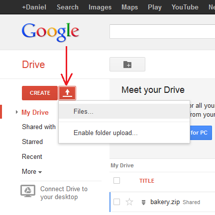
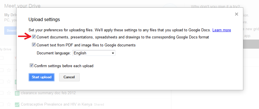
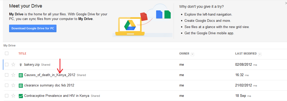
1. Download and install Open Refine here. http://openrefine.org/download.html
2. Launch OpenRefine.
3. Find the project named: “F1Results2012-2003. google-refine.tar.gz”
4. Import the project into Refine.

Basic functionalities of Open Refine
Facets: These are like Excel filters but with counters.
Types:
• Text
• Numeric
• Timeline
• Custom (Facet by blank, Facet by error, etc.)

Functionality:
• Applying a filter enables us to work onthe subset of data we are interested in.
• Add columns based on another column to modify all data in column
• Split columns by a character separator. For example, split:”Surname, Name” into the two columns “Surname” and “Name”
Figure 1: The use of Facets, Text Filters and Clustering

Figure 2: How to Split a column

We can use Open Refine to:
• Rename/Remove columns.
• Execture common transformations.
• Remove white space.
• Data type conversion (number to text, etc.)
• Lowercase, uppercase, title case.
• Cut parts of a text (substring).
• Replace parts of a text (replace)
• Fill down adjacent cells
• Remove “matched” rows (after filtering some rows or selecting a value on a facet we can remove only the matched rows).

Figure 3: Shows how to edit cells through common transforms.

NOTE: Most functionality is under common transforms.
Figure 4: shows how to remove all matching rows.
Clustering:
Helps to find similarities within texts in order to identify and standardize differences in spelling and format of entries. For example, identify that “Kakamega,” “Kaka mega” and “Kakamega County” are all the same. of the different clustering algorithms from finding very close matches to distant matches. It does not cluster values automatically but instead it shows the clusters to the user. So it is our decision in the end whether the different entries should all have a uniform name.

Figure 4: How to use clustering

Advanced functionalities to explore include:
• Obtaining new data through a web service.
• Retrieve coordinates based on address.
• Determine the language of a text.
• Get data from another project based on a common column (Like MS Vlookup).
• Using “cell.cross”

References
Google tutorials:
1. Introduction
2. Data transformation
3. Data augmentation

Documentation:
• User manual
• Google Refine Expression Language (all the functions available for us to use on our transformations).

Permalink to single post

Online News Association launches Kenya’s digital future

Internews logo 1                ONA

Failed healthcare promises, the human cost of abortion limitations and the need for access to contraceptive to prevent unsafe abortions were some of the big stories in the Nation, the Standard and the Star in November.
The journalists who told these stories, delivering the biggest week in Data Journalism in Kenya, will share their experiences mining data, conceiving and delivering the stories in accessible and visualized formats.. The data journalists will share their hopes for an open data movement in Kenya that will inform policy decisions and improve healthcare access for Kenyans.
The five storytellers, who are data journalism fellows at Internews, will display their digital media work at the inaugural event of the Online News Association Nairobi Group. The Online News Association (ONA) helps shape the future of journalism by organizing networking events, training opportunities and public discussions for local journalism community. ONA members are thought leaders, blazing a trail for digital journalism.
ONA Nairobi, initiated by Internews in Kenya, will be a space for resource sharing, collaboration and experimentation. It will showcase the talents of local media producers and innovators and support the needs of the changing journalism environment.
Internews in Kenya and ONA invite you to the inauguration of the ONA Nairobi Group, where the Internews in Kenya Data Fellowship stories will be presented.
The event will take place on Wednesday November 11 at 3 pm at the MRC.
Please join us for a lively sharing and discussion on the place of data and data journalism in improving access to health for Kenyans. We welcome journalists, developers and other open data activists committed to data and digital journalism.

Permalink to single post

Simple data scraping using online tools

Scraping is a set of techniques required to extract information from various formats like the web, PDFs, or scanned images   into a file type that can be analyzed further, for example into table formats including comma-separated values (csv) or  Microsoft Excel (xls) files.

There are online tools/websites that enable users to extract data from files by converting them. Some of the web based software for simple scraping of PDFs include:

The common steps to converting your PDF file on any of the three platforms are:

a)      Upload your PDF file

b)      Enter a valid email address. You should be able to access this email address because the converted file will be sent there.

c)       Click on the convert button. The web service will momentarily process the file and on completion display a success dialogue box.

d)      Open your email address to access your converted document.

As a practical example, we will try to convert this document which is uploaded on Google Drive. You must have a Google account to access the file.  The data set is about projected health development budget estimates from 2011 to 2014. We want to calculate thesum of the total health development county budget from 2010 through to 2014. We will convert the document into an Excel file so that we can use Excels’ sum function to get the total.

1) Download the file from Google Drive.

2) From your browser navigate to http://www.pdftoexcelonline.com/

3) Click on the “Select  a File” button as shown below. Browse to your saved file and select it. Click open then enter a valid email address to which the converted document will be sent to. You can opt to use a junk email service like http://www.mailinator.com . It enables you to receive emails without signing up. Just enter a random name e.g. [email protected] and click on “Check it.”

Mailinator

Enter the same email address on pdftoexcelonline.com

First step

4)      Click on Convert it! Button.

Convert

5)  The browser will momentarily give a dialogue box to inform you that it is processing your document. Then on completion, you will get a screen like the one below:

Complete

6)  If you check your mailinator account, you should now have one email in your inbox. The email is from pdftoexcel. It contains the converted document.

7) Download your document by clicking on the link provided.

Get file

Save the file on your computer. The downloaded file is now in Excel format (.xls) and therefore by opening it in Microsoft Excel, you are able to perform calculations on the dataset.

8)  We can test our file by performing a simple sum calculation on the county budgets from 2010 to 2014. Open the file in Excel, then in column G header, input Total or Sum.  In cell G2 is where we will perform our calculation. Click on cell G2 then do a sum function like in the diagram below.

9)

Summation

10)  Hit Enter. You get a Total of county health development budgets from 2010 to 2014 per county. You can now fill down to get the rest of the values.

Fill Handle

By converting the data from a PDF format to an Excel format, we were able to add a computational column called Total/Sum. We would not have been able to do this in a PDF file. This is an example of data scraping.

Permalink to single post

Letting the numbers tell the story

Mercyyutube

The print story

Many journalists find it difficult to remain objective when covering controversial and sensitive issues like abortions.

Internews in Kenya Data Journalism Fellow Mercy Juma, who is a TV journalist at NTV, used an evidence based approach to her story Grave Choices, on unsafe abortions.

The TV story

Her story was also published as a cover story in The Daily Nation’s DN2 and on the newspaper’s online platform as a multimedia piece.

She found a link between the unmet need for family planning and the high number of unsafe abortions in Kenya after comparing different datasets. Although the data had been openly available for several months no Kenyan
journalist had told this story.

In the following multimedia piece Mercy Juma reflects on the dilemma of reporting
on the issue, which is restricted in Kenya and prohibited by the major faiths.

Permalink to single post

How journalist conquered
his fear of numbers

fakeYoutubeScreenshot

The Tragedy of Unsafe AbortionsStarting out in data journalism can be overwhelming for journalists. But Internews in Kenya data journalism fellow Samuel Otieno, who works for The Star newspaper, has overcome his fear of numbers by learning statistics.

His decision paid off in a big way when he published a cross platform data driven story, Cost of unsafe abortion. The story looks beyond sensational headlines and delves deep into how universal access to contraceptives could reduce national health spending on post abortion care and the unnecessary death of women.

He shares his experience in the following multimedia piece.

Permalink to single post

‘Change for Health’:
The backstory

Watch the multimedia piece on Youtube

MisplacedprioitesMost journalists in Kenya are not taking advantage of the Internet to tell dynamic and interactive stories. But Internews in Kenya data journalism fellow Paul Wafula, who is an investigative reporter with The Standard newspaper, has broken the mold with his investigative story: Change for Health.

In the following multimedia piece Wafula explains how he used audio slides, interactive maps, infographics and a news app to tell the story of how much your county government is spending on developing your healthcare, the challenges and the misplaced priorities they face.

The app was developed by Internews data journalism fellow Dan Cheseret who is a developer. Apart from the online version, the story will be published as a five-part series in The Standard newspaper from today until Friday.

The News app, interactive maps and audio slides:
http://www.standardmedia.co.ke/health…

Alarm as 30 counties slash health budgets (12,November 2013) http://www.standardmedia.co.ke/health…

Misplaced priorities? Counties’ bitter prescription for ailing health sector (12, November 2013) http://www.standardmedia.co.ke/health…

New report reveals top and bottom counties in health spending (13, November 2013) http://www.standardmedia.co.ke/health…

False start as devolved units in once marginalised region fail balance test (13, November 2013) http://www.standardmedia.co.ke/health…

Kilifi County ranks low on health spending as disease ravages region (14, November 2013) http://www.standardmedia.co.ke/health…

Permalink to single post

Visualizing data using a tree map

A tree map is a way of visualizing data using nested rectangles to represent hierarchical (tree-structured) data that is part of a whole. Each rectangle has an area proportional to a specific dimension of data. Different colors are often used to represent different dimensions of the data. Tree maps also make good use of space as many items can be displayed on the screen at a glance. Google Charts enables users to build tree map charts without any coding required. For our tutorial, we will use a sample data set which was obtained from the Kenya Economic Survey 2013. You can download the data set from Google Drive.

Tree map data format

For Google Drive to generate a tree map chart, your dataset must be in a particular format. Here are some guidelines:

  • The first column must be the name of an object in the hierarchy.
  • The second column must contain the name of the object’s parent. Each parent name must appear in the first column.
  • The third column must be numerical as this is what determines the size of the rectangle. It must be a positive value.
  • The optional fourth column must be numerical. It controls the color of the box.

Go to drive.google.com to upload the dataset. Click on the upload icon then from the popup menu and select Files.

Upload Data

From the File selection window that appears, browse and select the Excel file. When the file is selected, an Upload Settings dialog box appears. Ensure that the “Convert documents, presentations, spreadsheets and drawings to the corresponding Google Docs format” checkbox is selected.

Upload Settings

You can choose to select the” confirm settings” checkbox so that Google Drive will prompt you for Upload settings before each upload. Click on the Start Upload button. Google Drive will upload your file and if successful, you should be able to see your file in the list of uploaded files. See diagram below:


File Uploaded

Next, click on the uploaded dataset. The spreadsheet will open in Google Spreadsheet format like in the diagram below;

Open XLS File

You will notice that “All deaths” appears in the first and the second columns. The way tree maps work is that a row has to have a parent. The first row has to be the parent name. That way, all the children can be assigned portions (Nested rectangles) based on the values. The rectangles are constructed based on the first column with numbers.

Next we need to select only the data that we want to visualize. Click on row A3 (All deaths) then do not release the mouse button. Drag the mouse all the way to cell D14. Your worksheet should now look like the diagram below. Only the data that we are interested in is highlighted.

Selected Data

Click on the Insert menu then select chart.

Insert Chart

Google will automatically detect the hierarchy in your data set. By default, it will suggest a Tree map for you. It will also list for you the possible charts as per your data set structure.

Chart Types

Select the tree map chart then click on Insert. The tree map will be inserted into your spreadsheet as in the diagram below.

Chart Inserted

To further customize your chart, double click on the white space above the chart then click on the drop down arrow and select advanced edit as shown below:

Edit Chart

A dialogue box opens up where you can customize your chart. From here you can change the chart title, enable or disable scale, select levels of data, font style and customize the header and scale.

Customize Chart

More customization can be achieved by coding your tree map. A good example can be found at https://developers.google.com/chart/interactive/docs/gallery/treemap

For more information on how to customize your chart, please visit Google Drive Help

You can also watch a video on tree maps at Youtube

Permalink to single post

Data graphics: visualizing stories

Media organizations across the world such as The New York Times, Washington Post, and the Guardian – regularly incorporate dynamic graphics into their journalism. Other than using static visuals to support stories in form of diagrams and charts, especially for print media, the internet has provided lots of space that journalist can use to visualize data in telling long-form stories.

DataWrapper is one of the available tools that aid journalists, designers and developers to integrate visuals into online stories. Visuals have become an important way of telling stories.

Guided by the basic elements of story telling – who, what, where, when, why, and how – visuals need to evoke the ‘so what’? There is no need to use visuals that confuse the reader instead their use is guided by simplifying data for consumption and revealing stories hidden in data.

Since DataWrapper is an Open Source tool, users are able to upload data and create simple, embeddable data visualizations in telling stories. Data journalism has facilitated the quick utilization of visuals to enhance stories with the aid of designers and developers.

In the example below, the readers are able to see the number of times Kenya Rugby has won, lost, or drawn, with clear reference to the number of matches Kenya has played with other countries. The simplicity of using DataWrapper makes it easy for a far broader population to both produce and consume visuals.

pic e
For starters, it is important to source, clean, and analyze a data set that best illustrates the story using available tools such as Excel, Google spreadsheets, or web table.

pic f
Once done, copy the text and paste the contents into DataWrapper’s first screen.
pic g
Choose upload and continue for DataWrapper to check and describe the data. There is an option to link the data to its source and the name of the organization that produced the data
pic h
Follow the next step to construct and customize the visuals that best illustrate the story. A choice is available from the select chart option.
pic i
The chart can be refined further by customizing the colours to best suit the visuals, as well as including a headline and short brief for the story before publishing.
pic j
After done with editing, publish and embed option, provides a link to the visual as well as embed code that can be pasted on another site.
pic k
DataWrapper currently offers five kinds of visualizations – line, bar, pie, table, and stream graph – but it is still undergoing a cycle of development aimed at enhancing and refining it application. Interactive and static data graphics have enriched websites, blogs, videos, and print visuals enabling designers and developers to package long-form stories for easier consumption.

« Older Entries