Data graphics: visualizing stories
Media organizations across the world such as The New York Times, Washington Post, and the Guardian – regularly incorporate dynamic graphics into their journalism. Other than using static visuals to support stories in form of diagrams and charts, especially for print media, the internet has provided lots of space that journalist can use to visualize data in telling long-form stories.
DataWrapper is one of the available tools that aid journalists, designers and developers to integrate visuals into online stories. Visuals have become an important way of telling stories.
Guided by the basic elements of story telling – who, what, where, when, why, and how – visuals need to evoke the ‘so what’? There is no need to use visuals that confuse the reader instead their use is guided by simplifying data for consumption and revealing stories hidden in data.
Since DataWrapper is an Open Source tool, users are able to upload data and create simple, embeddable data visualizations in telling stories. Data journalism has facilitated the quick utilization of visuals to enhance stories with the aid of designers and developers.
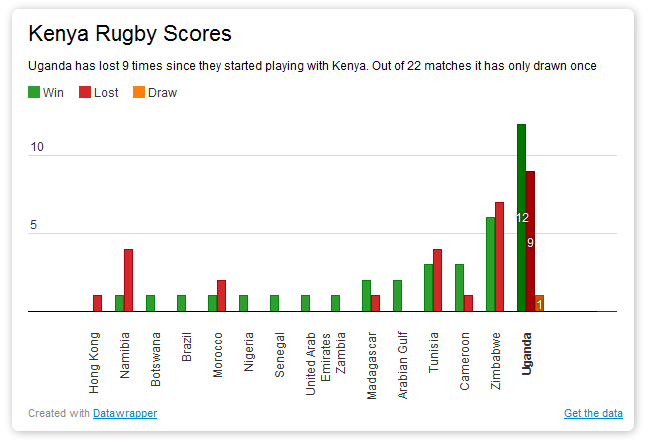
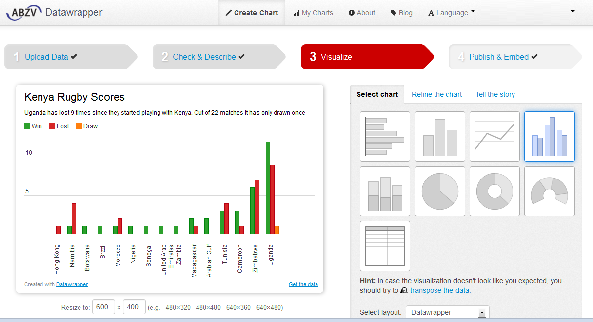
In the example below, the readers are able to see the number of times Kenya Rugby has won, lost, or drawn, with clear reference to the number of matches Kenya has played with other countries. The simplicity of using DataWrapper makes it easy for a far broader population to both produce and consume visuals.
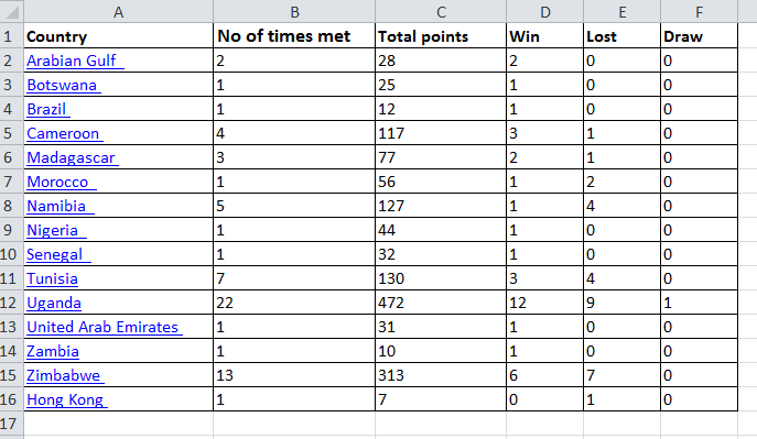
For starters, it is important to source, clean, and analyze a data set that best illustrates the story using available tools such as Excel, Google spreadsheets, or web table.
Once done, copy the text and paste the contents into DataWrapper’s first screen.
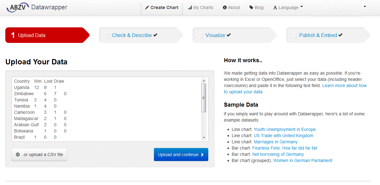
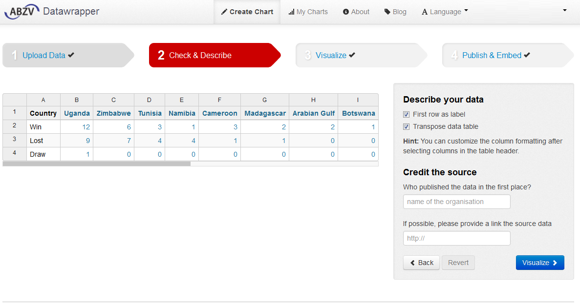
Choose upload and continue for DataWrapper to check and describe the data. There is an option to link the data to its source and the name of the organization that produced the data
Follow the next step to construct and customize the visuals that best illustrate the story. A choice is available from the select chart option.
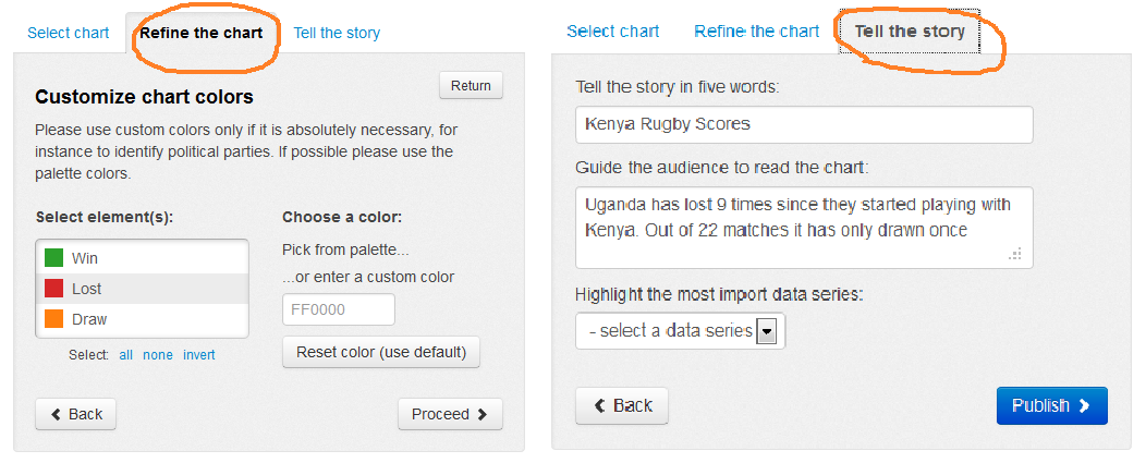
The chart can be refined further by customizing the colours to best suit the visuals, as well as including a headline and short brief for the story before publishing.
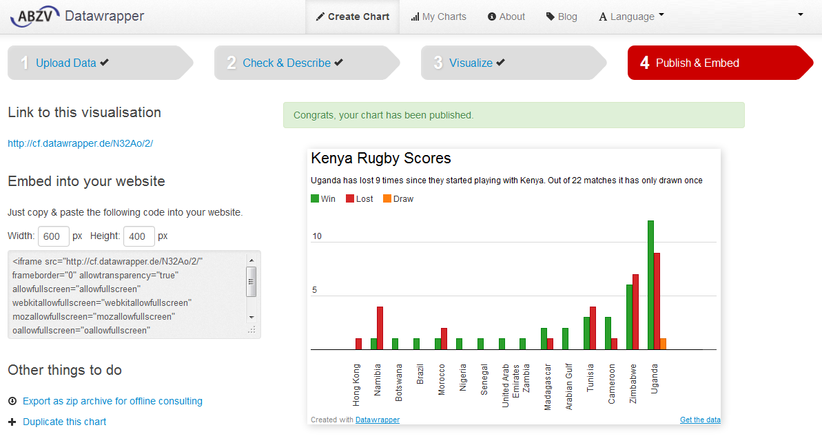
After done with editing, publish and embed option, provides a link to the visual as well as embed code that can be pasted on another site.
DataWrapper currently offers five kinds of visualizations – line, bar, pie, table, and stream graph – but it is still undergoing a cycle of development aimed at enhancing and refining it application. Interactive and static data graphics have enriched websites, blogs, videos, and print visuals enabling designers and developers to package long-form stories for easier consumption.