Visualizing data using a tree map
A tree map is a way of visualizing data using nested rectangles to represent hierarchical (tree-structured) data that is part of a whole. Each rectangle has an area proportional to a specific dimension of data. Different colors are often used to represent different dimensions of the data. Tree maps also make good use of space as many items can be displayed on the screen at a glance. Google Charts enables users to build tree map charts without any coding required. For our tutorial, we will use a sample data set which was obtained from the Kenya Economic Survey 2013. You can download the data set from Google Drive.
Tree map data format
For Google Drive to generate a tree map chart, your dataset must be in a particular format. Here are some guidelines:
- The first column must be the name of an object in the hierarchy.
- The second column must contain the name of the object’s parent. Each parent name must appear in the first column.
- The third column must be numerical as this is what determines the size of the rectangle. It must be a positive value.
- The optional fourth column must be numerical. It controls the color of the box.
Go to drive.google.com to upload the dataset. Click on the upload icon then from the popup menu and select Files.
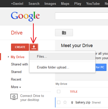
From the File selection window that appears, browse and select the Excel file. When the file is selected, an Upload Settings dialog box appears. Ensure that the “Convert documents, presentations, spreadsheets and drawings to the corresponding Google Docs format” checkbox is selected.
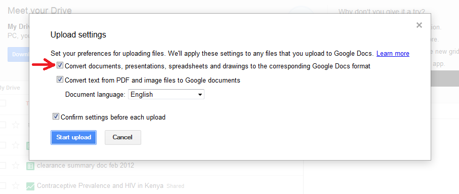
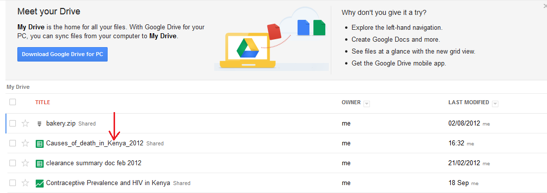
You can choose to select the” confirm settings” checkbox so that Google Drive will prompt you for Upload settings before each upload. Click on the Start Upload button. Google Drive will upload your file and if successful, you should be able to see your file in the list of uploaded files. See diagram below:
Next, click on the uploaded dataset. The spreadsheet will open in Google Spreadsheet format like in the diagram below;
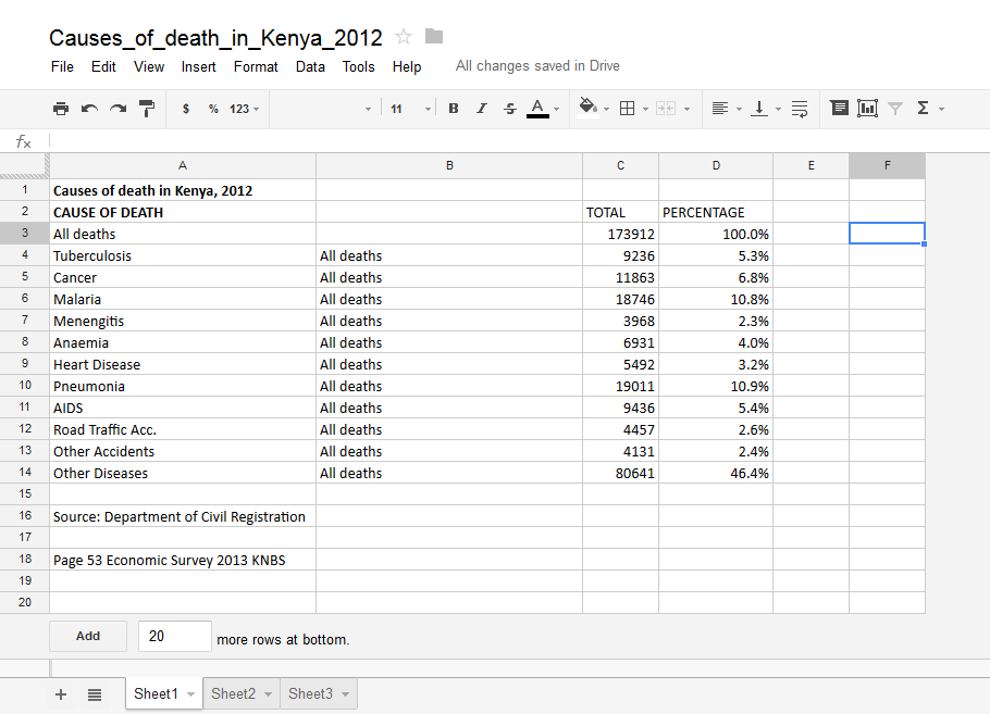
You will notice that “All deaths” appears in the first and the second columns. The way tree maps work is that a row has to have a parent. The first row has to be the parent name. That way, all the children can be assigned portions (Nested rectangles) based on the values. The rectangles are constructed based on the first column with numbers.
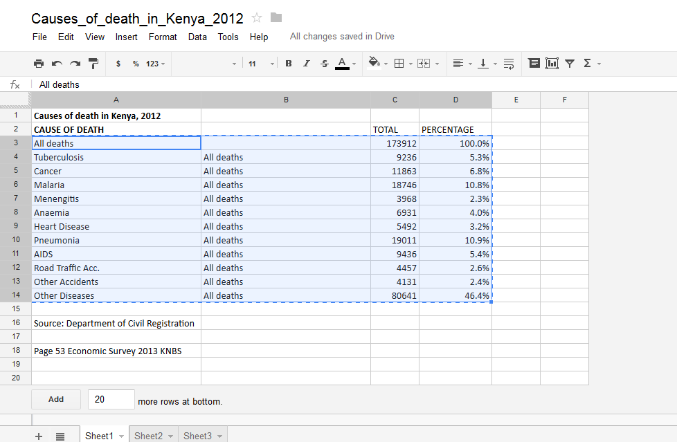
Next we need to select only the data that we want to visualize. Click on row A3 (All deaths) then do not release the mouse button. Drag the mouse all the way to cell D14. Your worksheet should now look like the diagram below. Only the data that we are interested in is highlighted.
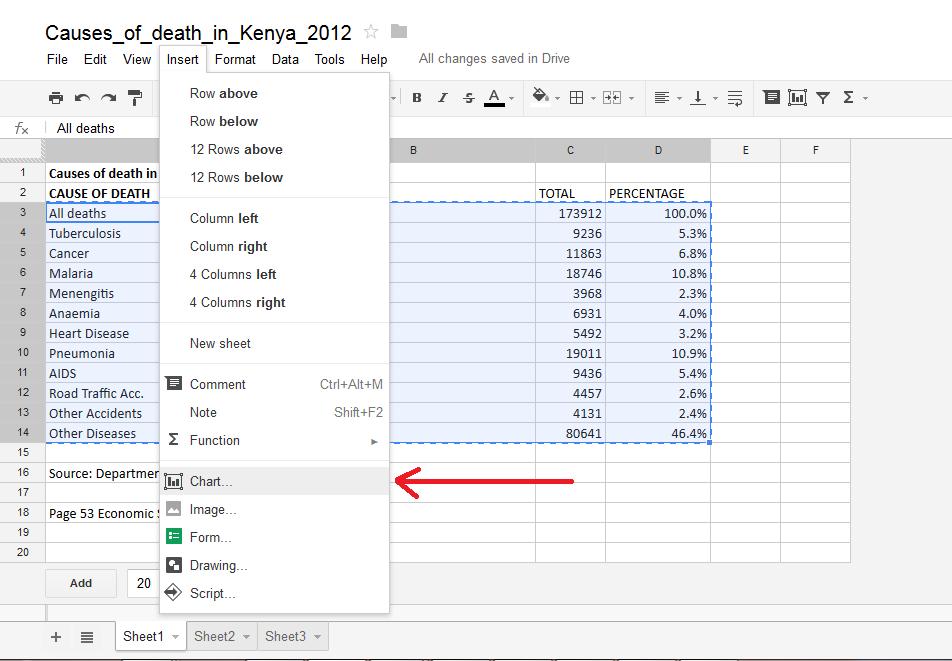
Click on the Insert menu then select chart.
Google will automatically detect the hierarchy in your data set. By default, it will suggest a Tree map for you. It will also list for you the possible charts as per your data set structure.

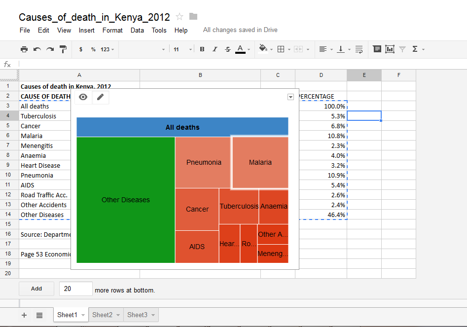
Select the tree map chart then click on Insert. The tree map will be inserted into your spreadsheet as in the diagram below.
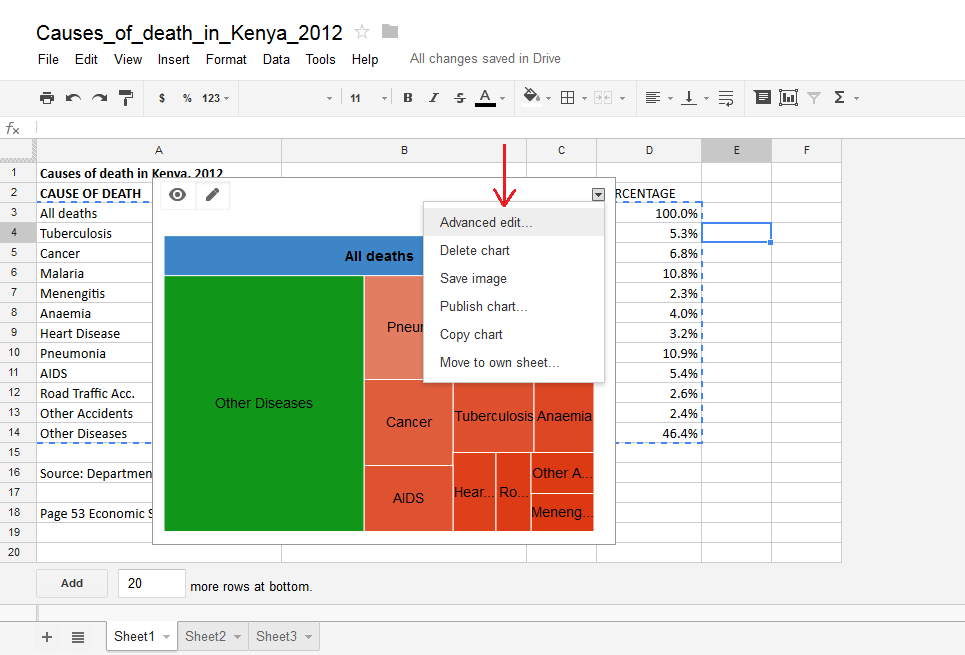
To further customize your chart, double click on the white space above the chart then click on the drop down arrow and select advanced edit as shown below:
A dialogue box opens up where you can customize your chart. From here you can change the chart title, enable or disable scale, select levels of data, font style and customize the header and scale.

More customization can be achieved by coding your tree map. A good example can be found at https://developers.google.com/chart/interactive/docs/gallery/treemap
For more information on how to customize your chart, please visit Google Drive Help
You can also watch a video on tree maps at Youtube