Using Excel pivot tables to analyze data
A pivot table can be used to quickly summarize and analyze data in a worksheet. Pivot tables have functionality including sort, count, and total and can even be used to create another table to display the summarized data. Pivot tables are an alternative to functions or formulas in Excel e.g. SUMIF, COUNTIF. Pivot tables can help to quickly change the views to explore your data.
What we are going to learn from this tutorial includes:
- How to create a pivot table from a data set
- How to format your data so that it can be used in pivot tables
- How to change the pivot table view to show different views of the same data set.
How to format your data set for pivot tables
You must format your data so that the pivot table displays properly. Below are some guidelines you need to follow:
a) Your data must have columns with headings. Label your data.
b) Ensure that there are no empty columns or rows. Delete the empty ones.
c) The quickest way to ensure that all data is selected and all empty cells below are not selected is to press CRTL+A (select all) on the keyboard.
Consistent data in all cells e.g. if a column is date, ensure that all values in that column are either dates or blank, if its quantity, ensure that all cells contain numbers.
Here is a sample data set that we are going to use for this tutorial. It’s a sample of premature births in Kenyan Hospitals in different regions. It is in Microsoft Excel format (.xlsx)
Using pivot tables
1) Start Microsoft Excel
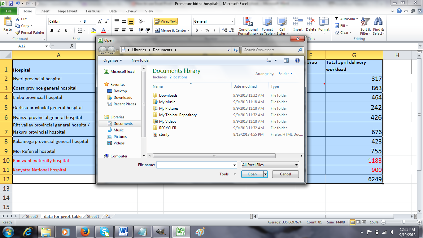
2) Open your data set either by double clicking or selecting File then Open menu as below:
3) Select data menu and choose pivot table. In Excel 2007/2010 go to the Insert menu on the toolbar then select Pivot table.
You will be presented with a screen like the one below:
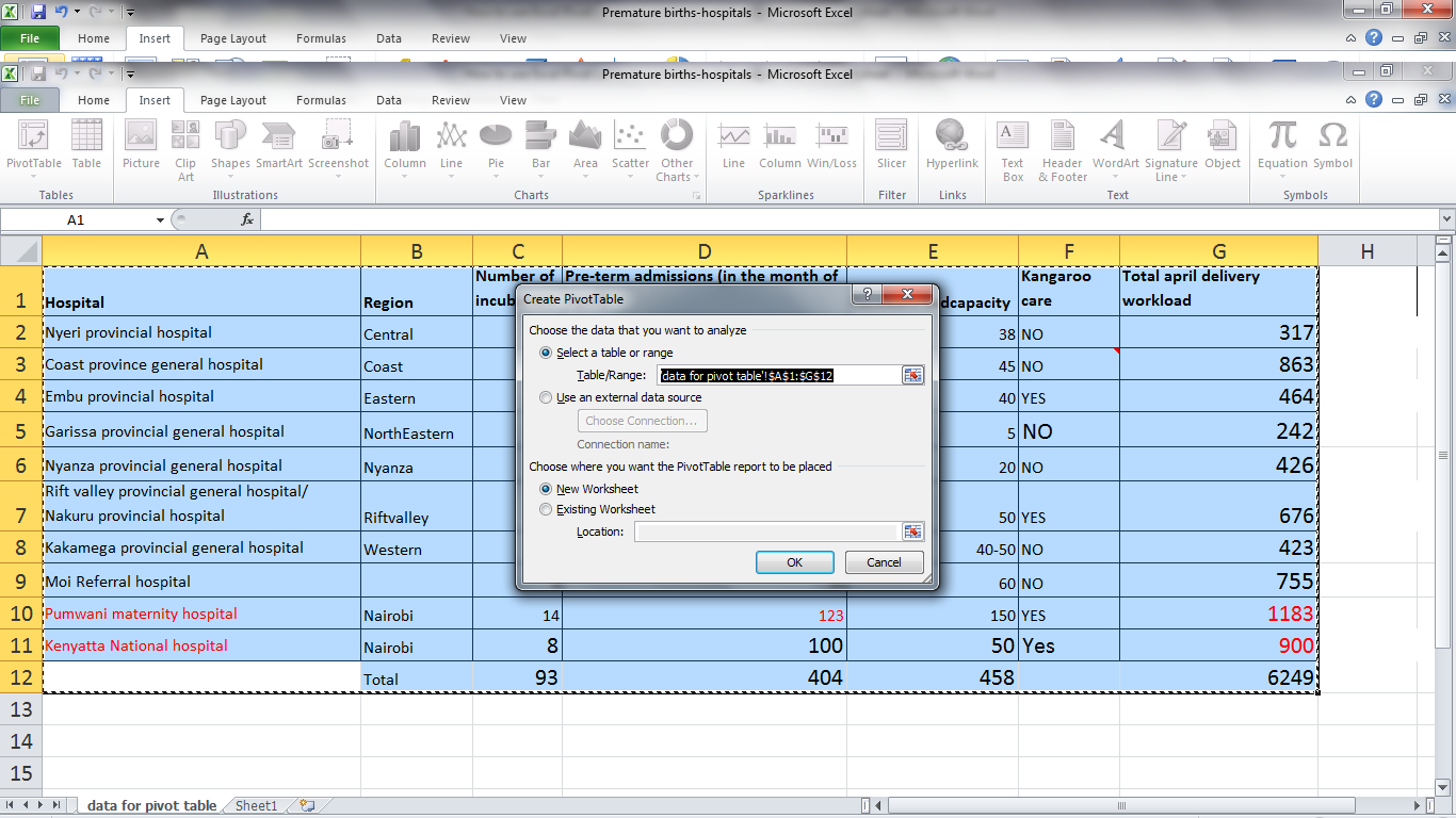
Select ok. Ensure that New worksheet option is selected so that the pivot table can be loaded onto a new worksheet. Excel will create a new worksheet in the current workbook. The pivot table will be placed on the blank worksheet.
4) Laying out the pivot table
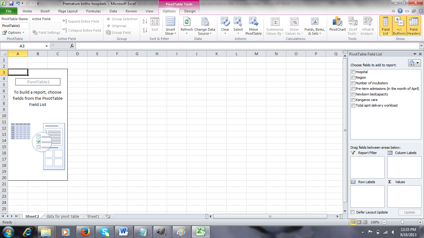
To begin analyzing your data, drag and drop fields from the pivot table field grid area. The pivot report is divided into header and body sections. The body contains rows, columns, Report filter and values. Drag and drop a field into any of the sections. For our case, I have selected the layout below:
In this layout, you are able to see at a glance the summary of region, hospital and number of incubators in one column. Notice how region, hospital and incubators are matched with their corresponding data automatically.
You can also drag a field into the report filter region to create a report filter. Take for example when you want to filter your data by whether the hospital has kangaroo care or not. To achieve this, drag the kangaroo care field onto the Report filter. You will notice a filter added to the top as the first column header. Clicking on the drop down menu gives you the options under kangaroo care.
This is a feature of pivot tables to help you quickly create filters. Selecting an option filters the data according to the criteria specified.
Pivot tables can also help you sort data in the layout you just created. Click on the row labels header as shown below:
This will enable you to sort your data either in ascending order or descending order, or by selecting an option or multiple options, for data that meet a certain criteria.
Value filters is also another important use of pivot tables. Value filters enables you to get data that is within a specified range. For this example, drag and drop number of incubators into values column. You should have a layout like the one on the diagram below:
We want to get hospitals which have a number of incubators between 5 and 15. These are just arbitrary values I chose. Click on the Row labels filter then select value filters then Between.
You will get a screen like in the diagram below:
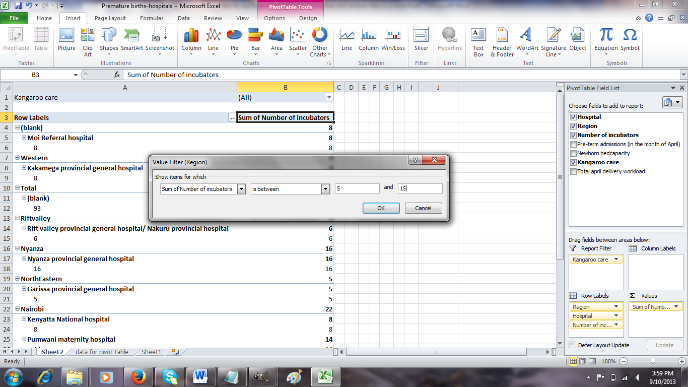
Enter 5 in the first text box and 15 in the second text box then click ok. The subsequent window will show only hospitals with a number of incubators between 8 and 15. This kind of filtering helps the user to quickly get data with values within a specified range.
Here is a YouTube tutorial to practice building pivot tables.
http://www.youtube.com/watch?v=peNTp5fuKFg
You can also check out the following links for more practice.
http://spreadsheets.about.com/od/datamanagementinexcel/ss/8912pivot_table.htm
http://www.wikihow.com/Create-Pivot-Tables-in-Excel
http://www.homeandlearn.co.uk/excel2007/excel2007s7p7.html
http://fiveminutelessons.com/learn-microsoft-excel/how-create-pivot-table-excel