Author Archives: Daniel Cheseret

Daniel Cheseret
About the Author: Daniel Cheseret
Few developers in Kenya would consider applying for a data journalism fellowship but not Daniel Cheseret. Having realized that the growing importance of data journalism has created new career opportunities in the newsroom, he applied for Internews Data and Health Journalism Fellowship. I will learn more about producing infographics, data mining and creating news applications,” says the software, developer and webmaster. Among his achievements is developing a news management software for Citizen TV. While working with Royal Media Services, the company that owns Citizen TV, he developed over 10 websites for the group. After five years he left to start a consultancy firm.
Author Website: https://internewske.org
Permalink to single post

Simple data scraping using online tools

Scraping is a set of techniques required to extract information from various formats like the web, PDFs, or scanned images   into a file type that can be analyzed further, for example into table formats including comma-separated values (csv) or  Microsoft Excel (xls) files.

There are online tools/websites that enable users to extract data from files by converting them. Some of the web based software for simple scraping of PDFs include:

The common steps to converting your PDF file on any of the three platforms are:

a)      Upload your PDF file

b)      Enter a valid email address. You should be able to access this email address because the converted file will be sent there.

c)       Click on the convert button. The web service will momentarily process the file and on completion display a success dialogue box.

d)      Open your email address to access your converted document.

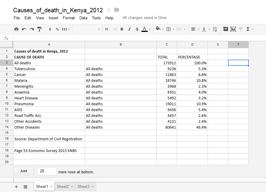
As a practical example, we will try to convert this document which is uploaded on Google Drive. You must have a Google account to access the file.  The data set is about projected health development budget estimates from 2011 to 2014. We want to calculate thesum of the total health development county budget from 2010 through to 2014. We will convert the document into an Excel file so that we can use Excels’ sum function to get the total.

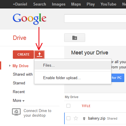
1) Download the file from Google Drive.

2) From your browser navigate to http://www.pdftoexcelonline.com/

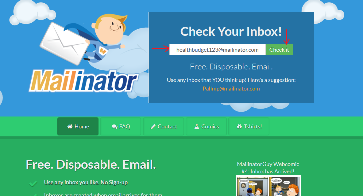
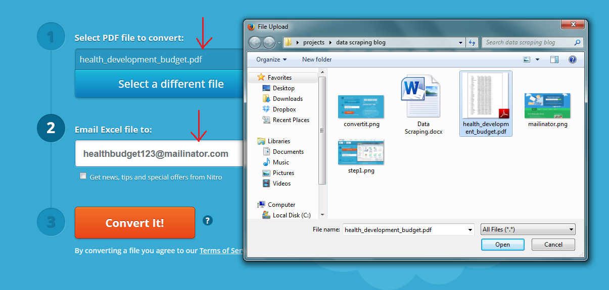
3) Click on the “Select  a File” button as shown below. Browse to your saved file and select it. Click open then enter a valid email address to which the converted document will be sent to. You can opt to use a junk email service like http://www.mailinator.com . It enables you to receive emails without signing up. Just enter a random name e.g. [email protected] and click on “Check it.”

Mailinator

Enter the same email address on pdftoexcelonline.com

First step

4)      Click on Convert it! Button.

Convert

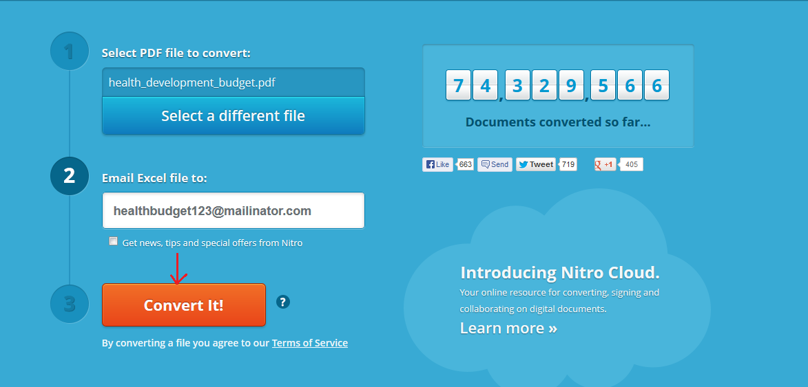
5)  The browser will momentarily give a dialogue box to inform you that it is processing your document. Then on completion, you will get a screen like the one below:

Complete

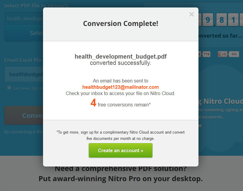
6)  If you check your mailinator account, you should now have one email in your inbox. The email is from pdftoexcel. It contains the converted document.

7) Download your document by clicking on the link provided.

Get file

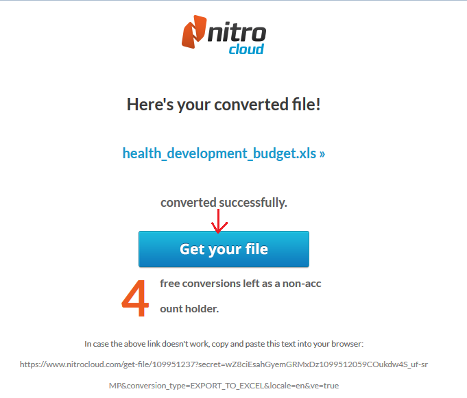
Save the file on your computer. The downloaded file is now in Excel format (.xls) and therefore by opening it in Microsoft Excel, you are able to perform calculations on the dataset.

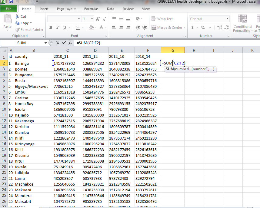
8)  We can test our file by performing a simple sum calculation on the county budgets from 2010 to 2014. Open the file in Excel, then in column G header, input Total or Sum.  In cell G2 is where we will perform our calculation. Click on cell G2 then do a sum function like in the diagram below.

9)

Summation

10)  Hit Enter. You get a Total of county health development budgets from 2010 to 2014 per county. You can now fill down to get the rest of the values.

Fill Handle

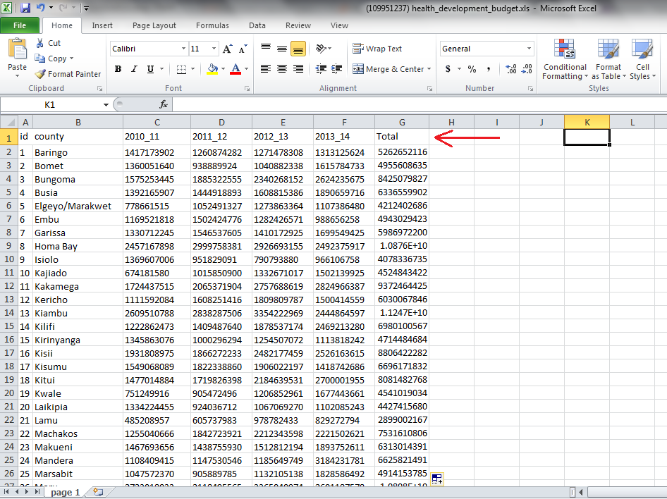
By converting the data from a PDF format to an Excel format, we were able to add a computational column called Total/Sum. We would not have been able to do this in a PDF file. This is an example of data scraping.

Permalink to single post

Visualizing data using a tree map

A tree map is a way of visualizing data using nested rectangles to represent hierarchical (tree-structured) data that is part of a whole. Each rectangle has an area proportional to a specific dimension of data. Different colors are often used to represent different dimensions of the data. Tree maps also make good use of space as many items can be displayed on the screen at a glance. Google Charts enables users to build tree map charts without any coding required. For our tutorial, we will use a sample data set which was obtained from the Kenya Economic Survey 2013. You can download the data set from Google Drive.

Tree map data format

For Google Drive to generate a tree map chart, your dataset must be in a particular format. Here are some guidelines:

  • The first column must be the name of an object in the hierarchy.
  • The second column must contain the name of the object’s parent. Each parent name must appear in the first column.
  • The third column must be numerical as this is what determines the size of the rectangle. It must be a positive value.
  • The optional fourth column must be numerical. It controls the color of the box.

Go to drive.google.com to upload the dataset. Click on the upload icon then from the popup menu and select Files.

Upload Data

From the File selection window that appears, browse and select the Excel file. When the file is selected, an Upload Settings dialog box appears. Ensure that the “Convert documents, presentations, spreadsheets and drawings to the corresponding Google Docs format” checkbox is selected.

Upload Settings

You can choose to select the” confirm settings” checkbox so that Google Drive will prompt you for Upload settings before each upload. Click on the Start Upload button. Google Drive will upload your file and if successful, you should be able to see your file in the list of uploaded files. See diagram below:


File Uploaded

Next, click on the uploaded dataset. The spreadsheet will open in Google Spreadsheet format like in the diagram below;

Open XLS File

You will notice that “All deaths” appears in the first and the second columns. The way tree maps work is that a row has to have a parent. The first row has to be the parent name. That way, all the children can be assigned portions (Nested rectangles) based on the values. The rectangles are constructed based on the first column with numbers.

Next we need to select only the data that we want to visualize. Click on row A3 (All deaths) then do not release the mouse button. Drag the mouse all the way to cell D14. Your worksheet should now look like the diagram below. Only the data that we are interested in is highlighted.

Selected Data

Click on the Insert menu then select chart.

Insert Chart

Google will automatically detect the hierarchy in your data set. By default, it will suggest a Tree map for you. It will also list for you the possible charts as per your data set structure.

Chart Types

Select the tree map chart then click on Insert. The tree map will be inserted into your spreadsheet as in the diagram below.

Chart Inserted

To further customize your chart, double click on the white space above the chart then click on the drop down arrow and select advanced edit as shown below:

Edit Chart

A dialogue box opens up where you can customize your chart. From here you can change the chart title, enable or disable scale, select levels of data, font style and customize the header and scale.

Customize Chart

More customization can be achieved by coding your tree map. A good example can be found at https://developers.google.com/chart/interactive/docs/gallery/treemap

For more information on how to customize your chart, please visit Google Drive Help

You can also watch a video on tree maps at Youtube

Permalink to single post

Visualizing data using DataWrapper

DataWrapper is an online tool that helps anyone to create embeddable charts in minutes.  The main advantages of using data wrapper are:

a)      It is easy to use. It saves on time needed to create an embeddable chart.

b)      User has full control. It is free software. You can choose to use their online hosted server or download and install on your PC.

c)       It is easy to customize. Users can customize layout, fonts and colors to match their website. » Read more

Permalink to single post

Data visualization using Tableau Public

Data visualization is the presentation of data in a graphical or pictorial format. Because of the way the human brain works, in processing information, it is faster for the human brain to understand many data points when they are displayed in visuals (charts or graphs) rather than going through many spreadsheets or pages and pages of reports. Let’s say for example you have thousands of spreadsheet reports that you need to understand in a short time to make a decision that is informed by the data. To make that data-informed decision, you need visualization. » Read more

Permalink to single post

Using Excel pivot tables to analyze data

A pivot table can be used to quickly summarize and analyze data in a worksheet. Pivot tables have functionality including sort, count, and total and can even be used to create another table to display the summarized data. Pivot tables are an alternative to functions or formulas in Excel e.g. SUMIF, COUNTIF. Pivot tables can help to quickly change the views to explore your data. » Read more

Permalink to single post by Leave a comment Data Journalism , , ,
Permalink to single post

Kenya’s internet users reach 16.2 million

Internet usage in Kenya is rising fast, accelerated by international mobile bandwidth growth. The number of Internet users in Kenya grew by 11.6  percent growth from the end of September to the end of December , 2012, from 14.5 million 16.2 million users. » Read more