As the world cup in Brazil kicked off this week the hosing country is one of the favorites among the fans. And judging from predictions and betting odds they are likely to win. But how do you best visualise prediction data? In this piece we will examine five different ways of showcasing predictions by looking at current news graphics from various media outlets.
BSports basic progression chart.
Bloombergs’s sports analytics section BSports took a linear approach in their chart. The simplicity of this chart is its strength.
It reminds the reader of a progression chart, showing the order the winners of different stages of a cup will play each other. Progression charts are commonly displayed at any cup both at amateur and professional levels, so it is user friendly and easy to interpret and understand.
Visually however, this chart does not tell a clear story. The viewer has to read all the names to track which group the likely winner will be from as there is no visual hierarchy in-between the teams BSports predicts will win and the ones that will lose.
They could have solved the problem by highlighting the tracks of the teams they project will play for the gold in the colors of their groups (see my edit to their graphic).
Circular confusion at the Economist
The Economist instead chose an interactive circular progress chart (right) in combination with a bar chart.
The circle chart, which is slightly confusing at first look, has all the teams taking part in the World Cup and the predictions of the wins at each level, with final in the middle.
This chart is way too complex and confusing to stand alone, but together with the bar chart it provides the context that a bar chart alone would not have provided.
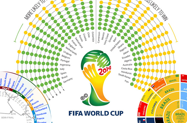
Intuitive radical map
While graphic designer Cobba Stevens also took a circular approach in presenting the predictions, his chart that resembles a radical tree map is much more intuitive.
The reader can clearly see which colors that dominate, which visually illustrates the teams that are predicted to win each of the final matches.
The only weakness with a chart like this is that the visual clearness may give a puffery impression of the likelihood that predicted winners will end up with the trophy.
Weighting the likelihood
Graphic design company inforapicbox, chose to focus more on comparing each teams probability for win in their matrix dot chart of the predictions.
The great thing about this chart is that it is simple, easy to understand and allows the reader to make comparison between the teams.
The visual sense (more green, higher likelihood) of this chart is strong, while still being true to the data by rounding off percentages rather than showcasing one winner although the likelihood might be similar.
Great gradient table
Sports website Five Thirty Eight Sports also chose to illustrate the difference in likelihood and not showcase specific predicted winners.
Apart from their interactive graphics for each team and group, they created this table to provide an overview of the cup.
What makes this table work well is the combination of a traditional table and the gradient. This allows the data to be visually interpreted effectively, while providing the richness and detail of the numeric data.
These five ways of showcasing prediction data, each have strengths and weaknesses. As media outlets get flooded with content from the world cup in Brazil, I hope more of the sport sections will experiment with visualisations of sports data. But to truly answer the question of who will be the winner of the cup, we will have to wait to the last minute of the final.