
By Callie Long
Bubble charts have little to no traction with Kenyan audiences of print news. Bar charts on the other hand are generally considered more credible and “scientific.”
But if you want interest and inferences drawn from the news you’re conveying, then the best information graphics to use are pictorial infographics.
These were some of the findings of a recent study conducted by Internews in Kenya to gain a deeper understanding of how the country’s news audiences perceive and understand the graphic images used to tell data-driven stories in the media.
Kenya is seeing a rapidly emerging open data culture, and the country’s media is very much a part of the global trend of data-driven journalism and its use of infographics to convey powerful stories.
Newsrooms are leapfrogging ahead in adopting this potent way of news storytelling. Internews as a data journalism training provider, however wanted to gain a deeper understanding of the meaning news audiences ascribe to infographics, how people understand the visualization of data and whether they retain the information shared through the visual images.
In addition, as an infographics service, through Data Dredger, Internews wanted to make sure, based on evidence, that the infographics provided make sense to news audiences as a form of contemporary cultural expression.
 The findings of a survey with 49 people showed that there was little to no difference in people’s ability to retain information, regardless of whether they had consumed the news in a text-based or visual form.
A further test of comprehension, preference and the perceived usefulness of distinct visualization styles however indicated marked differences when it came to concern or care about the subject matter. Thirty five people were interviewed and asked to appraise a news infographic that included human figures as symbols, a bar graph, and a bubble graph designed to compare relationships between different data objects.
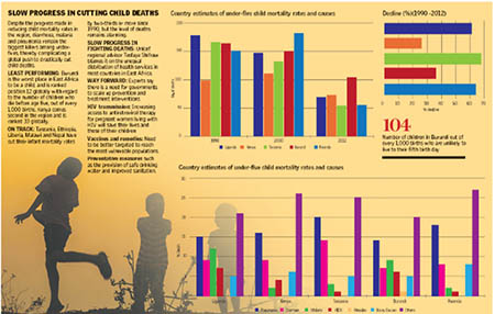
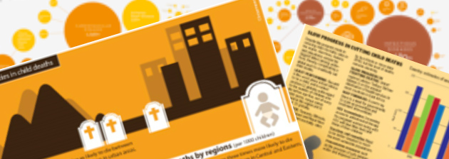
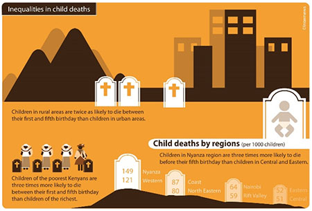
 The three visualizations tested were: 1) Inequalities in child death in which the content related to unequal child mortality rates in the different provinces of Kenya. The infographic was created by Internews. 2) Slow progress in cutting child deaths; a bar chart from a regional newspaper, The East African.
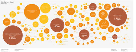
Print media consumers are used to this traditional approach to visualizing data. 3) 20th Century death: A bubble graph by British data journalist and visualizer, David McCandless, designed to compare relationships between data objects in three numeric-data dimensions. This high concept style would not typically be used in mass media, but is becoming popular on web-accessed information sites.
The majority of respondents said that the “inequality” infographic was the easiest to grasp as “simple” or “clear.” When gauging concern for the subject matter, the “inequalities” infographic was most commonly cited, with expanded thoughts about the underlying causes of inequality. Of significance was that many respondents offered unprompted explanations or inferences from the information presented in this infographic.
“This illustration of the grave makes you want behaviour change and strive to have a decrease in child mortality,” noted one of the respondents. Participants were able to recall facts from the ‘Inequalities’ infographic best. Though a few respondents said they found the pictographs cartoon-like, and therefore not to be taken seriously, many respondents appeared moved by the picture story.
One respondent commented: “I looked at it and the only question I was asking was why would a country allow a child to die?”
Most respondents did not understand the “20th Century death” bubble chart and few were inclined to engage in a discussion about its contents at all. A small minority of the respondents had difficulty comprehending any of the visualizations, but were nevertheless able to recall at least two of the three salient facts included in the “inequalities” infographic (that children of the poorest Kenyans are three times more likely to die young; and that children in rural areas are twice as likely to die compared to those in urban areas.)
This was a timely study given the rapid expansion of data depiction to determine what value the public derives from it. At the outset of the study it was not known what significance media consumers attached to visualized information in their news reports. We have some indication now.