What story does this data tell?
The Washington Post seeks to explain new demographic projections by the United Nations Population Division that, "Africa will see a population explosion nearly unprecedented in human history."
How does the data visualization strengthen the story?
Compare this version in the Los Angeles Times to the Washington Post story. In the Washington Post’s version:
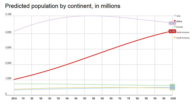
- The first interactive chart allows you to see the rising population of Africa in comparison to a slower population growth of other regions. The text explains the reasons behind the growth and decline.
- The second chart tracks the populations of the five most populous countries. The text explains the impact of the growth of the Nigerian population and how the “the demand on resources, social services, schools and roads increases by a factor of eight.” It also predicts the problems China will face due to its shrinking population.
- The third chart shows the near convergence of the population of Africa and Asia. The text explains why such rapid population growth changes the politics, society and economy of a region. It highlights two essential factors for a successful boom: good governance and careful resource management.
In effect, the charts balance out rather dense explanations of the causes and effects of population growth across various regions and enable readers to compare and contrast the impact across regions. The charts enhance the text but are not a substitute for research.
What makes these visualizations effective?
- All the graphics are simple, interactive and clear. There is a separate chart for each topic.
- There is no extraneous information to detract from the information the author wants to convey.
- Each chart is followed by a clear explanation of the graph.
- There is a link to consult the data source and download the original data set below each graph.
- The tool used to create the graphic is cited.
How can this story be adapted to the Kenyan context?
- This story invites a variety of national comparisons. How does Kenyan population growth compare to the rest of Africa? Average life expectancy? Average number of children per woman?
- What are the projections for GDP per capital in Kenya versus in other African countries and Africa as a whole? and to Asia over the last 50 years of economic growth? Does slower population growth equate to higher GDP per capital?
- What is the dependency ratio: Percentage of the population either under age 15 or over 65 for Kenya in comparison to its neighbors? How does that affect Kenya’s economic future?
- Additional factors can be added such as employment rates and education to explore the longer term economic consequences of the demographic swell in Africa.
To develop a version of this story for the Kenyan media, please contact us at: [email protected]