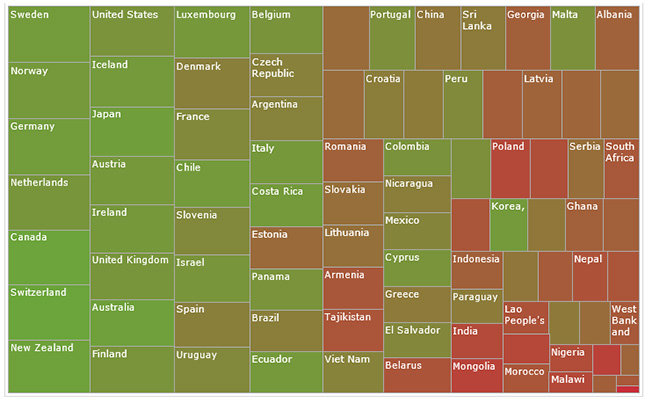
The data-driven story that was published in The Telegraph explores which is the best and worst country to grow old in. The story looks at several factors including welfare and pensions, access to public transport and the health status of old people around the world. It uses data from the Global Index Report 2013 which shows that the happiest place to grow old in is Sweden followed by Norway and Germany. The worst place is Afghanistan.
How does the data strengthen the story?
Through data analysis the writer shows that income is not the only factor which determines quality of life. For instance, despite the United Kingdom being richer than Germany, ageing Britons are better off spending their later years in Germany than in their country. Although it has universal pension and an enabling environment, Britain ranks lower than Scandinavian countries due to shortage of buses and poor accessibility of trains to the elderly.
HelpAge International who developed the index visualized the data fairly well using interacting bar graph and heat maps.
What makes these visualizations effective?
The attractive visuals draw the reader to interact with the data for more information. Most of the visuals are easy to understand.
How can this story be adapted to the?
As life expectancy grows in Kenya similar data sets could be mined and analyzed to come up with stories that inform policies that improves the wel lbeing of the elderly.
To develop a version of this story for the Kenyan media, please contact us at: [email protected]


