What story does this visualization tell?
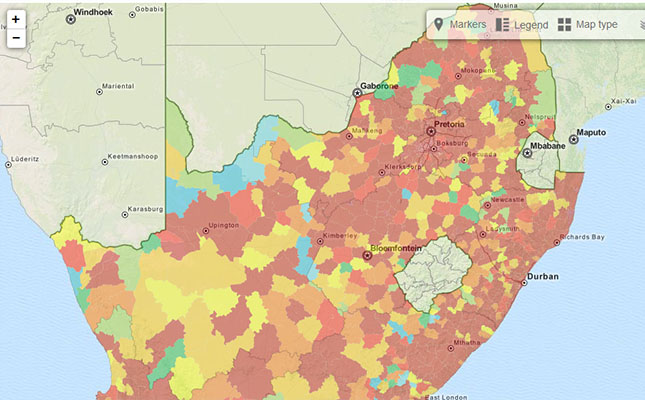
This map gives a detailed picture of crime in South Africa. Developed by the Institute for Security Studies the interactive map gives the reader fast and easy access to tones of data. Apart from breaking down the crimes per districts and in both crimes per 10,000 citizens and absolute numbers this map also shows trends by providing data for the last ten years.
How does the data visualization strengthen the story?
This map must be the ultimate tool for a South African crime reporter. It does not tell one story alone but thousands as you can filter the data in 36 different categories per the numerous districts. Murder, assault, burglary, sex crimes, theft and carjacking - you name it, it’s there. The color code shows the level of crime in South Africa . The pop up gives the trend over the last ten years and additional information such as the population in the district.
What makes these visualizations effective?
The richness of the data, the interactivity and the easy navigation is what makes this map so great. Besides providing data that could go with almost any crime story, the map is also searchable by address. If you visit the site on a device that is able to register your GPS location (smart phones, pads etc.) or if you chare you IP address, the map will give you the statistics of crimes at you location.
How can this story be adapted to the Kenyan context?
The crime situation in South Africa is somewhat similar to Kenya, with crime being a big threat to the livelihood of the citizens and an immense cause of insecurity in the country at large. In contrast to Kenya, the South African Police Service does provide some crime statistics on their website, although in the unfriendly PDF format. If Kenyan police would follow the lead of South Africa this map could be replicated and provide a steppingstone towards more data driven crime stories.
To develop a version of this story for the Kenyan media, please contact us at: [email protected]


