What story does this visualization tell?
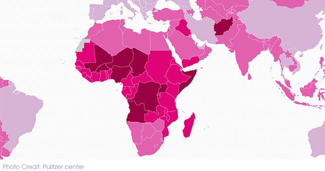
This insightful map developed by the Pulitzer center showcases fertility and infertility rates worldwide. It also provides data on contraceptive use, child mortality and GDP per capita for each country, which enhances the readers understanding of the complex issue.
How does the data visualization strengthen the story?
The map helps the reader to discover the trends by engaging with the data. It encourages them to explore the situation in different countries instead of simply displaying an analysis.
A deeper understanding is also gained by alternating between the fertility and infertility map. Attached to the map are links to stories that exemplifies the data. One story tells the tale of infertility among poor South Africans, and how their access to infertility treatment is limited.
What makes these visualizations effective?
Fertility rate is closely linked to economical and social development. Presenting each country’s GDP per capita together with the prime data gives the context of family planning’s role in economic development.
The colors of the map are appealing and easy to differentiate which is essential for fast interpretation of fertility levels.
How can this story be adapted to the Kenyan context?
Fertility and family planning is a vital issue as Kenya strives to develop its economy. A similar map could be made showing fertility levels, the perceived ideal number of children, contraception use and the unmet contraception need in various counties.
To develop a version of this story for the Kenyan media, please contact us at: [email protected]