What story does this visualization tell?
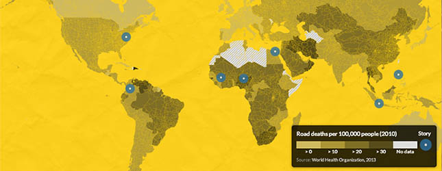
The beautiful interactive map shows reported and estimated traffic accident deaths around the world. It breaks down the distribution of causes of deaths by cars, motorcycles, bikes and pedestrians. The site shows the death ratio per 100,000 residents and examines the level of law enforcement on traffic regulations such as maximum speed, helmet, seatbelt and alcohol use.
How does the data visualization strengthen the story?
The interactivity of the map allows the audience to explore the data to get the overview of the situation around the globe. If the same data were presented in a table only a few people would take the time to find their own country and check its score.
The interactivity in combination with the vibrant colour, the easy navigation and the clear presentation makes the site successful. Overall the site is appealing to the eye.
How can this story be adapted to the Kenyan context?Kenya records a high number of deaths due to accidents every year. According to a Kenyatta University study, over 3,000 lives are lost every year and more than 3,000 are left with serious disabilities.
A similar interactive visualization could map and compare road traffic deaths by counties or roads.
The audience would be interested in knowing how safe the roads they use are and to question whether the government has invested in improving the roads that kill the most Kenyans.