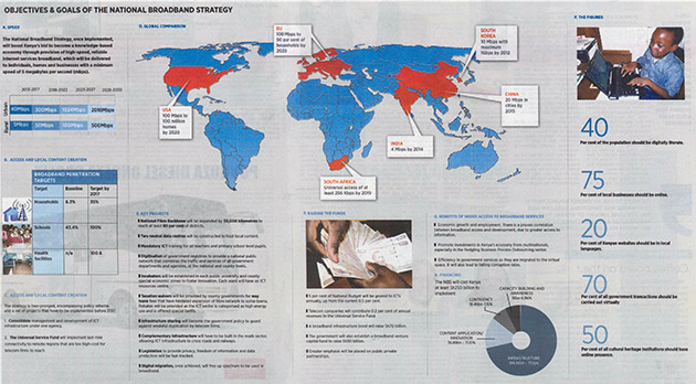
Overall it has a great structure in terms of placement of the design elements. The grey background color gives a neutral framing while the red and blue colors provide good contrast. So far so good, let us take a closer look.
But the infographic has way too much text. The graphic designer or journalist should have reduced about on third of it, simplified the information and visualized more of the data. For example, the infographic states that national fiber backbone will be at least 30,000km long without giving the reader any context of how far that is. Some googleing and simple math could have simplified this to three quarter of the circumference of earth.
Instead of mixing pictures and icons in the same design element, I recommend you go for just icons. More icons make it easier for the reader to navigate in the infographic. This is because the brain digests pictures and icons better and faster than text.
On the free online platform thenounproject.com I found many icons that could have been used (for an example hospital, education, house, speedometer, piggy bank, money, coworking space, partnership, law, computer, flip chart).
Lastly, I wish the infographics headline would have been a bit “sexier” as they say in the newsroom. Objectives & goals of the national broadband strategy sounds a bit dry to me. A headline like, Coming soon: high speed Internet would have grabbed more readers attention better.
To learn how to create compelling infographics, please contact us at: [email protected].