Most media houses covered this year’s Forbes list of billionaires like the Chicago Tribune. Following the same line as in past years, their stories merely focused on who topped the list, the biggest net worth gainer, how many billionaires made the list, and their average net worth. But the Guardian went against the norm to tell a deeper data driven story about wealth inequality.
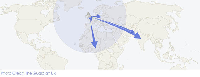
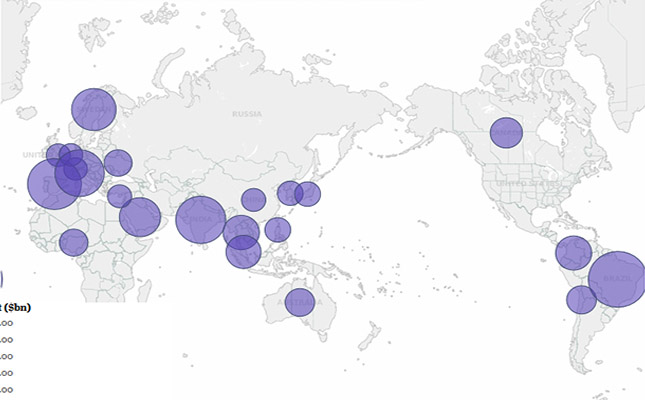
The story by journalist Mona Chalabi is based on an Oxfam report, which reveals that the richest 85 people have the same amount of wealth as the poorest half of the world, and the Forbes list. The Guardian then mapped out the data and created a slider that readers drag to see where the richest are. Below the map they created a chart listing the names of the billionaires, source of their wealth and age and next to it they had the billionaires’ net worth bar graph.
How does the data make the story effective?
The use of poverty data transforms the story from one of a few rich people to the bigger issue of wealth inequality, a matter that concerns all readers.
How is the visualisation effective?
From the map it is easy to tell where the billionaires are concentrated around the world while the pop up information is easy to understand. To avoid cluttering the map with information, the map is complemented by bar charts with scroll down menus.
How can this are applied in Kenyan context
Similar interactive visualisations could have been used to present the recent Kenya Certificate of Primary Education and Kenya Certificate of Secondary Education examination results. For instance, a similar map could have been used to show the top performing and worst performing schools as well as candidates and their average scores.
For data-driven stories contact us on [email protected]