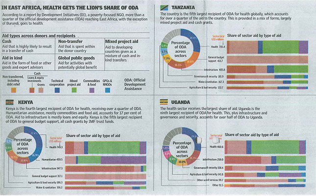
The infographic used in the article Aid to EAC out of step with citizens’ needs that was published in the East African newspaper is a good example of how to illustrate data in a simple way. The infographic is based on a report by development initiatives, a non-governmental organization that deals with poverty issues. At a glance a reader can see that more than quarter of the official development assistance (ODA) to East African countries, with the exception of Burundi, goes to health.
This is because the doughnut graphic depicts the share of sector aid in terms of percentages and the colour scheme makes the divisions into sectors distinct and easy for the reader to distinguish the sizes.
For this and more designs on how to analyse data and use it to create infographics, please contact us at [email protected]
Health gets the lion’s share of ODA in East Africa