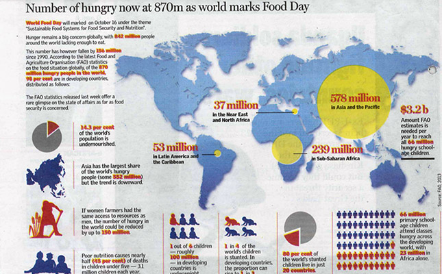
With a world map, pie charts and pictograms, The East African told the world food insecurity story in half a page.
The simple and informative data driven infographic was published on October 12 to mark the World Food Day. Based on the latest Food and Agriculture Organization statistics, it depicts the number of hungry people globally.
Bubble charts are used to represent the proportion of people affected by hunger. Asia and the pacific islands have the largest share of hungry people followed sub-Sahara Africa, Latin America and the Caribbean.
The infographic focuses on the number of underweight children in developing world. Simplified pictograms are used to show that one out of six children - roughly 100 million children - in developing countries is underweight while one out of four children in the world is stunted. A pie chart is used to show that 80 percent of the stunted children live in only 20 countries.
From the infographic on learns that half of the 66 million primary school pupils who attend classes hungry across the world are from developing countries. Learning on an empty stomach affects their performance.